
Getting More From Dynamics 365 Reporting4 min read
Most businesses collect huge amounts of data in Dynamics 365 every day. The challenge comes in making sense of this data.
Too often, teams rely on spreadsheets or lengthy reports to understand what's happening across sales, marketing and customer service. By the time those reports are created and shared, the data may already be out of date.
The good news is that some of the most powerful reporting tools in Dynamics 365 are available straight out of the box. By making better use of views, charts, and dashboards, organisations can quickly identify trends and make more informed decisions without leaving the platform.
Start with Views: The Foundation of Better Reporting

One of the most valuable and overlooked reporting tools in Dynamics 365 is the humble view.
Views allow you to create focused lists of records using custom columns, filters, and sorting. Instead of scrolling through hundreds of records, users can immediately see the information that matters most.
For example, a sales manager could create a view showing:
- Opportunities closing within the next 30 days
- Deals worth more than £50,000
- The opportunity owner
- Estimated revenue
- Probability of closing
Likewise, a customer service team could build views to highlight high-priority cases, records approaching SLA deadlines, or unresolved issues assigned to specific team members.
The benefit is simple: users spend less time searching for information and more time acting on it.
Use Charts to Spot Trends Quickly

Once you've created meaningful views, charts can help bring that data to life.
Charts provide a visual way to understand performance and identify patterns that may not be obvious in a list of records. With many different charts on offer, visual reporting makes it easier to spot trends at a glance.
Imagine a sales team reviewing opportunities by stage. A chart can instantly show where deals are progressing smoothly and where opportunities may be becoming stuck. Similarly, a service team could monitor cases by priority to identify areas requiring immediate attention.
Rather than analysing rows of data, users can quickly understand what's happening and where action may be needed.
Bring Everything Together with Dashboards
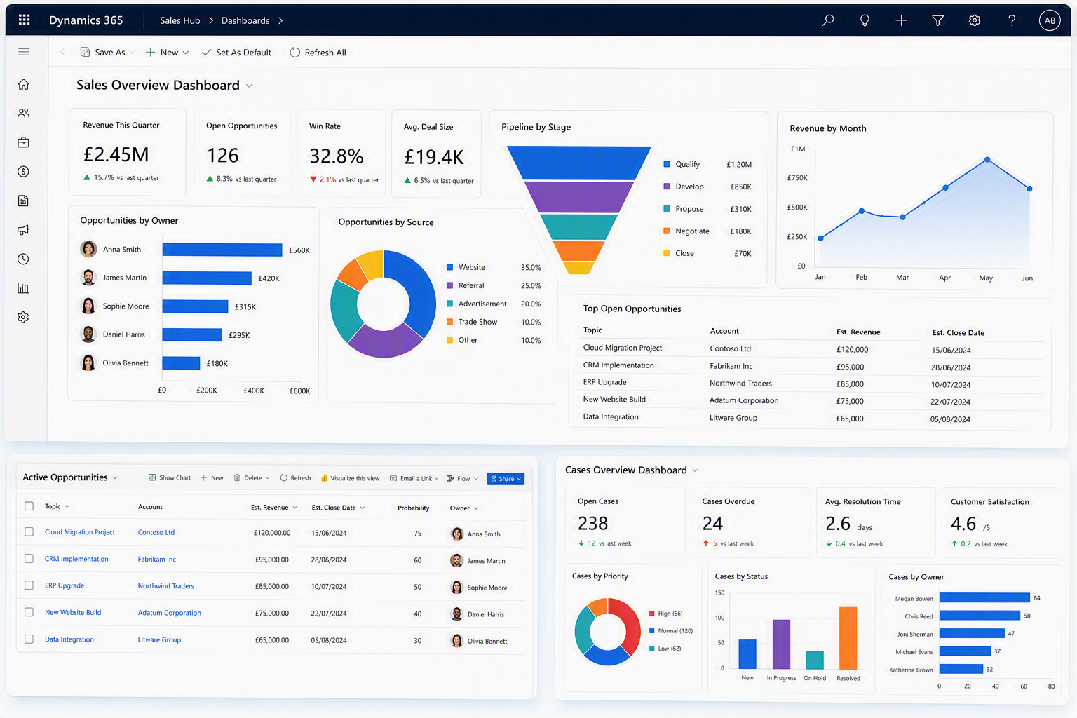
Dashboards take reporting a step further by combining multiple views and charts into a single screen.
A Sales Manager's dashboard might include:
- Pipeline value
- Opportunities by stage
- Revenue performance
- Upcoming activities
Meanwhile, a Customer Service Manager may want to track:
- Open cases
- Cases nearing SLA deadlines
- Resolution times
- Team workloads
Having this information in one place improves visibility across the business and allows managers to monitor performance without constantly running reports or switching between screens.
Final Thoughts
Effective reporting doesn't always require complex analytics or external software. In many cases, the key is simply presenting the right information in the right way.
By combining customised views, interactive charts, and tailored dashboards, Dynamics 365 enables teams to surface important data faster and improve visibility across the business, resulting in more informed decisions.
If your organisation is still relying heavily on spreadsheets and manual reporting, now may be the perfect time to explore the reporting capabilities already available within Dynamics 365. Get in touch with Cloud9 to learn how we can help you build views, charts, and dashboards that provide meaningful insights and support better decision-making across your organisation.